- News
- Finance
- Opinion
- Analysis & Insight
 Christie & Co: ‘UK hotel market signalling phase of stabilisation in 2026’
 Drinks menus must adapt to meet new consumer preferences
 The breakfast blindspot: Why Britain keeps overlooking the most valuable daypart in American hospitality
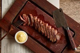
 Wok the line: how Wagamama is pushing back against the challenges of casual dining
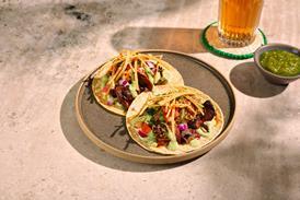
- Interviews
- Innovation
- People
- Events
- Subscribe now


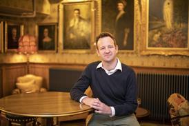


Big Interview: Byron boss on burgers, breakfast and Brexit

It’s fitting that Simon Wilkinson joined Byron Burger as CEO on the first of May, aka Mayday, aka the universal call of distress. Established in 2007, Byron was once a leader in the premium burger space, and it was sold for a very tasty £100m in 2013. But it was subsequently troubled by a combination of new competition and the general malaise affecting the sector and it came close to collapse. In January 2018 it underwent a CVA restructure that saw it close around a third of its 67-strong estate.
Already have an account? Sign in