


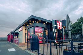


Papa John’s to roll out new branding
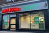
The new look has been unveiled at its Potters Bars store, with the branding be rolled out to its +500 store estate in the UK
Already have an account? Sign in

The new look has been unveiled at its Potters Bars store, with the branding be rolled out to its +500 store estate in the UK
Already have an account? Sign in