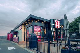
Crussh’s three rebranding exercises rewarded the business with LFLs ranging from 20% to 40% M&C has learned.

Speaking to delegates at M&C Allegra’s Food to Go Conference 2016, the healthy food concept’s CEO Chris Fung said that each rebranding had a huge payoff for the business.

“It’s not really a recommendation, it’s more just what happened with us, I’m sure there’s much, much better ways of doing it.”

The business was founded in 1998 as a juice and smoothie chain and now has 26 stores across London.

Crussh’s original look included a lot of purple, orange and fiberglass and was “quite futuristic”, Fung said.

In 2003, the company began its first rebranding process, dialling down the purple, boosting the orange and bringing in more natural materials, he said.

“We wanted to be quite vibrant and quite energetic and try to create an oasis to combat against the London dreariness.

The first rebrand saw LFLs leap 40%, Fung said. The capex cost for the rebrand was £30,000, which was paid off within a month, he said.

“In 2010-2012, we went all the way through the recession, it was actually quite a challenging time, we knew we needed to go through a couple of brand iterations, but capex was pretty constrained.

“When we started to come out of the recession and we had a little bit of capital again.

“We introduced the concept of Fit Food. We’ve always done food, something people didn’t necessarily know, and people associated us with juices only, that was our challenge – to bring in the mind-set that we did food, and did it pretty well.”

The second rebrand saw the continuation of more natural materials, contemporary replica Eames chairs, a gallery wall and the insertion of more humour to the brand, Fung said.

The second rebrand saw the not only concept evolve, but also saw LFLs rise 20%, Fung said. The rebrand cost around £60,000 and was paid off in around eight months, he said.

Crussh’s third rebrand, which began in 2013, bringing it to its current look, was “quite a revolution”, Fung said.

“It’s chalk and cheese, the pendulum’s really swung the other way around, we’ve dropped the juice in the logo and moved it to being predominantly about fit food.

“We’ve tried from a branding perspective to be much more London, much more urban and quite sophisticated.

“In the first three iterations we were quite constrained because the thinking at the time was to keep the logo – we later knew the logo itself had a lot of constraints and I’m glad we broke free from those shackles.”

The latest rebrand wasn’t cheap, costing around £60,000 to £100,000, but was worth it, Fung said.

LFLs on average increased by 28% with a low of 6% and the most successful store seeing LFLs rise 78%.

As a result, the refits were paid off within three to six months, he said.

“It’s meant we’ve started getting noticed again” – through both awards and media coverage, he said.

Despite the rebrandings, the company’s philosophy and drive for progression – with both its menu and its look - had remained the same, Fung said.

“There’s a lot going on and it’s allowed us to set the scene for the next phase of growth.

“When I look back at this, it’s only with the benefit of hindsight that I get that brands must evolve, or they die.

“You don’t really have a choice nowadays, the consumer and competitor pressures change all the time.

“In some cases, it’s actually worth being bold, revolution is the safest choice.”