


New Mamago logo revealed
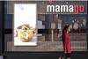
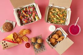
The logo for The Restaurant Group’s spin-off Mamago has been unveiled, along with teasers of the new menu. The Mamago logo will use the same font as the original Wagamama logo, as well as the familiar red and white colour scheme, plus its signature single red star. Meanwhile the menu, specifically designed for the spinoff, looks set to include wraps packed with Pan-Asian ingredients and fruit pots.
Alternatively SUBSCRIBE for unrestricted access to all content. Contact us for more information